

Treemap charts, also known as mosaic charts, help you visualize hierarchical data and present it in a clear, concise way. Get the steps to create a treemap chart in Excel along with examples of how you can use it.
What is a treemap chart?
First, a treemap chart is a type of data visualization that displays hierchical data as a set of nested rectangles. Each rectangle represents a category or subcategory, and its size is proportional to the value it represents. Treemaps are particularly useful for showing the relative size of different components within a dataset.
Features of a Treemap chart
- Hierarchy representation: Treemaps show relationships between categories and subcategories
- Proportional sizing: The size of each rectangle of the treemap chart reflects the value of the data it represents
- Color coding: Colors can group related categories or highlight trends
Examples of how to use a treemap chart in Excel
Accountants can use treemap charts to provide clear, concise overviews of financial data, such as:
- Expense analysis: A treemap chart can show company expenses by category like marketing and operations as well as subcategories, such as digital advertising and building rent. You can then quickly identify which expense categories and subcategories are the largest.
- Revenue breakdown: Show reenue by product line or region, with subecategories for individual products or specific locations
- Budget allocation: Display how a budget is distributed across departments or projects
- Profitability analysis: Compare the profitability of different business units or product lines.
Creating a treemap chart in Excel
Now that you have a better idea of what a treemap chart is and what you can use it for, we're walking through each step so you can create your own.
Prepare your data
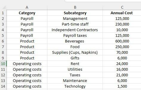
First, you need to organize your data in a hierarchical structure. In the chart below, we have a portion of the annual budget for a coffee shop with the data divided into:
- Category: Your main grouping. In the spreadsheet below, this includes payroll, products, operating costs
- Subcategories: A more detailed breakdown of what's in the categories. Payroll subcategories include management, part-time staff, independent contractors, and payroll taxes while product and operating costs have their own subcategories.
- Value: This is the numerical data to be visualized. In this case, the value is annual cost which are the budgeted costs for each subcategory.
Select your data
To select your data, you'll want to highlight the entire dataset, including your heading.
Insert the treemap chart in Excel
With your data highlighted, you'll follow these steps:
- Select the Insert tab on the Excel ribbon at the top of the page.
- In the Charts group, click on Insert Hierarchy Chart.
- Choose Treemap from the dropdown menu.

By selecting this information, we created the following treemap chart in Excel.

By summarizing your data in Excel using a treemap, anyone can easily see that Product takes up the most space in the annual budget, especially beverage ingredients and components. On the other hand, payroll and operating costs make up a very small amount of the budget. Rather than having to pour through a spreadsheet of information and add up sums, the treemap chart provides a quick, highly visual way to process the information.
Customizing your treemap
Once you have your chart, you can customize it to make it more informative or visually appealing.
- Chart title: Click on the default chart title to change and edit it
- Colors: Use the Chart design tab on the ribbon to change the color scheme
- Data labels: Right click on any rectangle in the chart and choose Add Data Labels to display the values directly on the chart.
You can also adjust chart elements through the Chart Elements button. This small plus sign next to the chart lets you add or remove elements like the legend, data labels, or grid lines.
Once you have the treemap chart to your liking, you can analyze the data easily, or share it with stakeholders.
Using a treemap in Excel effectively
To get the most out of your treemap, here are some tips:
- Avoid overloading the chart with too many categories or subcategories so it's easier to read
- Use accessible and meaningful colors that make it easy to distinguish between categories or highlight trends. Minimize excessive use of red and green because people who are colorblind may have difficulty reading the chart.
- Combine with other charts, such as line or bar charts to show trends.
Download our FREE Guide to Automation in Excel
Accounting, audit, and tax professionals spend a lot of time in Excel, but with new automation features and functionality, you can save time and improve the accuracy of your data! In our free ebook, Excel Essentials for Accountants: Boosting Productivity and Accuracy with Automation, you'll learn how to automate tasks and calculations, build tables, and more!
Download our FREE ebook Excel automation for accountants
With step-by-step tutorials and real world examples, learn valuable automation functions in Excel that save time, improve accuracy, and and enhance your skills!


